![Lowercase “k”. Part of project “FontFront Letters” [RJ 0047]: Typographic design.](https://cdn.myportfolio.com/e510cb4ab3282c2ee88bb5e070952caf/2a3f3fa2-159a-4011-8bd2-f53b9691ce85_rw_1200.jpg?h=cb891cdec59a18d2b34be42ca72e124b)
Lowercase “k”. Part of project “FontFront Letters” [RJ 0047]: Typographic design.
![Number “7”. Part of project “FontFront Letters” [RJ 0047]: Typographic design.](https://cdn.myportfolio.com/e510cb4ab3282c2ee88bb5e070952caf/2ee24e00-b188-43b2-b253-df78c36abb8e_rw_1920.jpg?h=fe97c96ff5999d90143490d6a0af7da4)
Number “7”. Part of project “FontFront Letters” [RJ 0047]: Typographic design.
![“ah” ligature. Part of project “FontFront Letters” [RJ 0047]: Typographic design.](https://cdn.myportfolio.com/e510cb4ab3282c2ee88bb5e070952caf/c06f74e9-2734-4005-abfd-ef080a0ef9fb_rw_1200.jpg?h=7d97d49cdd6e0de8fdc81f5ae72db76d)

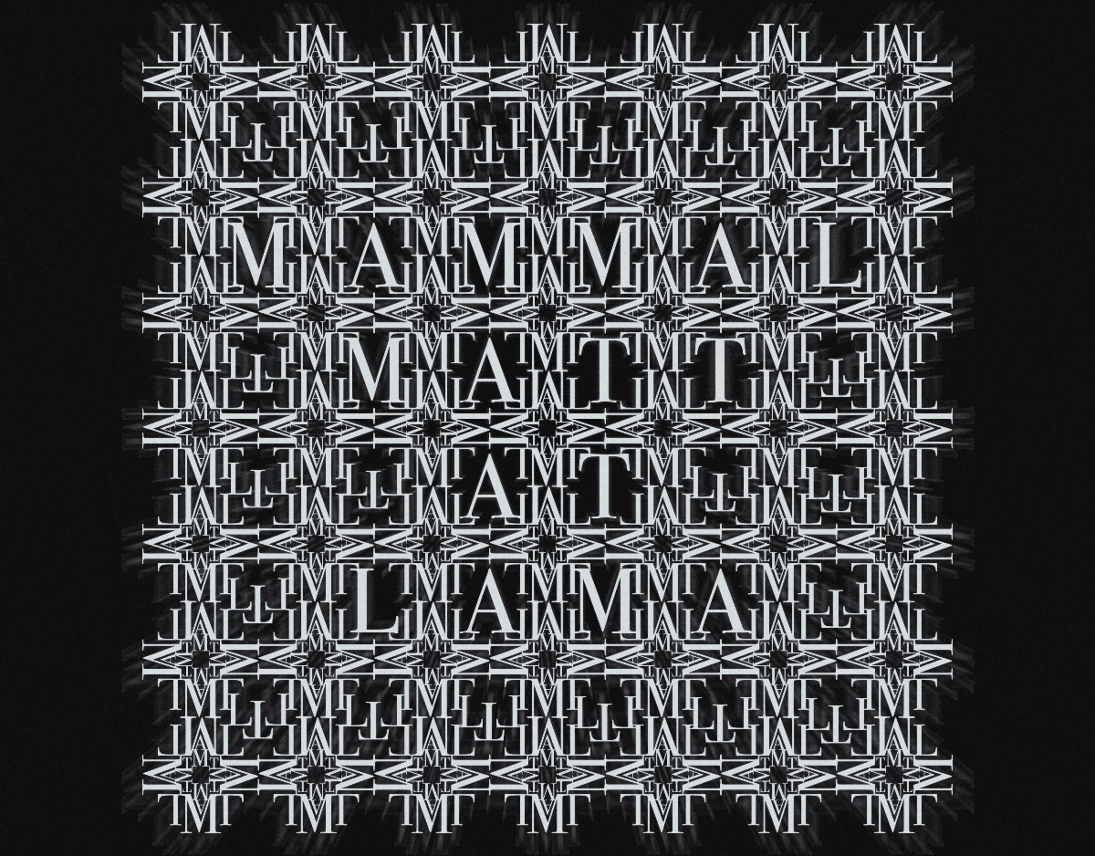
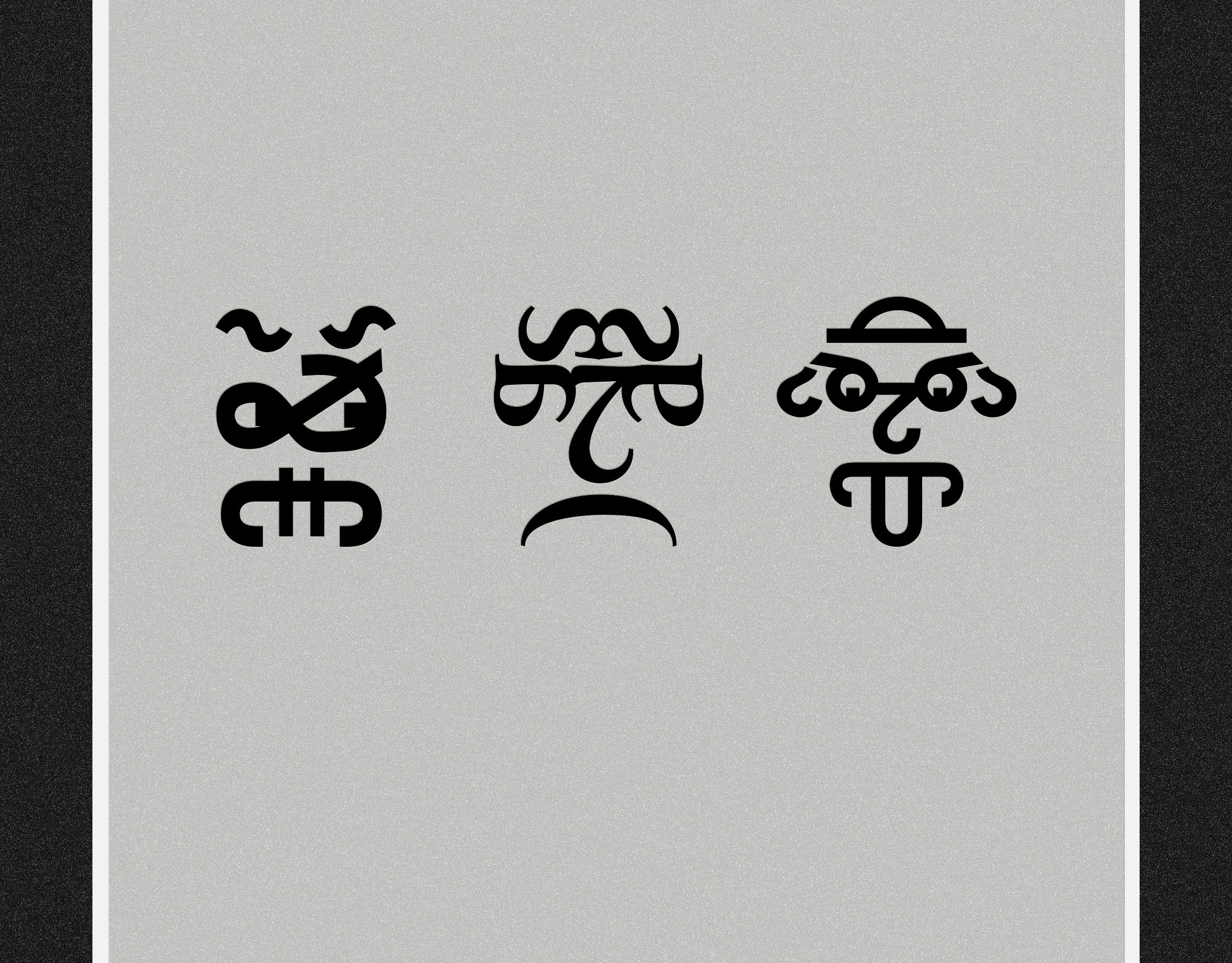
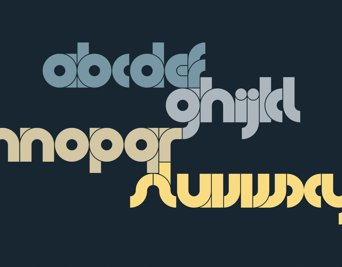
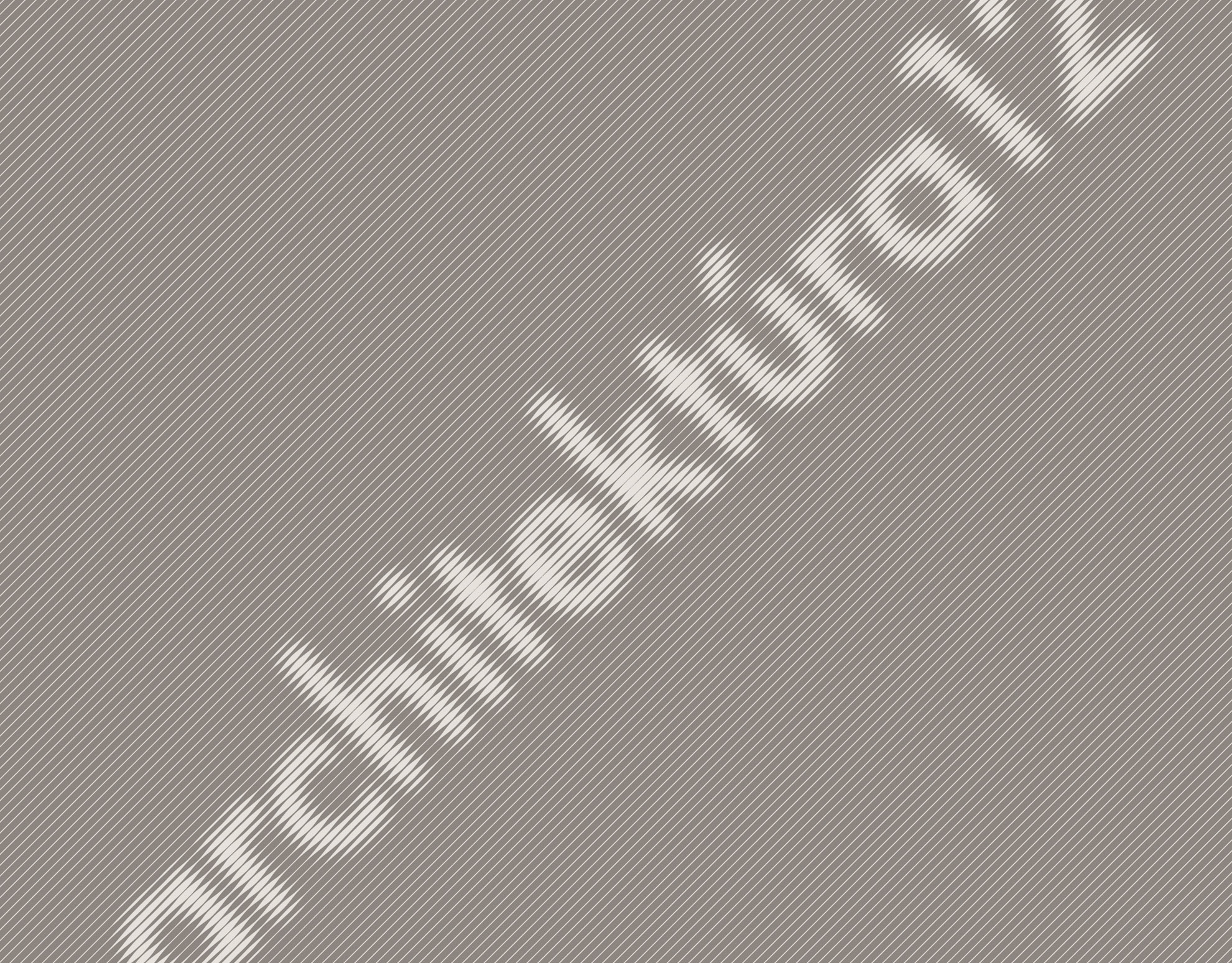
Back in April 2012 I took part in a contest organized by Hungarian graphic designers. The subject of the tournament was an almost daily typographic duel of the same glyph illustrated/redesigned by both players. (The afterlife or “side effect” of this story can be followed in The Signed Nature 1 set.) My first two contributions to the game were the lowercase “k” and the number “7”. (I lost the duel each time, sad, but true.) The letter was a vector output of a rasterizing application fed by a blurred image of a Bodoni glyph, which was split and regrouped again in Illustrator, then finally filtered in Photoshop. The number, in contrast, was drawn and rendered in a 3D application, after which I applied some image adjustments on it. The third candidate—the “ah” ligature produced in Illustrator and Photoshop only—finally won the contest.