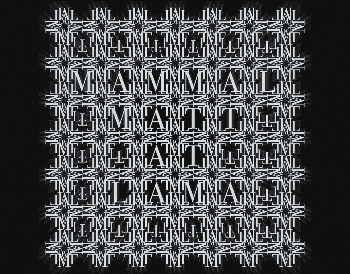
![Front cover. Part of project “Oppositions” [RJ 0010]: Experimental booklet design.](https://cdn.myportfolio.com/e510cb4ab3282c2ee88bb5e070952caf/a10672fa-0050-4343-a359-f6ebbc678f6e_rw_1920.jpg?h=766997d9cee1603e88eacbfea3e7db00)
Front cover. Part of project “Oppositions” [RJ 0010]: Experimental booklet design.
![Front and back covers. Part of project “Oppositions” [RJ 0010]: Experimental booklet design.](https://cdn.myportfolio.com/e510cb4ab3282c2ee88bb5e070952caf/4e771054-cfbd-4747-80e5-44e062c412e0_rw_1920.jpg?h=0b11a67abbdbce08e79f447ab6049b51)
Front and back covers. Part of project “Oppositions” [RJ 0010]: Experimental booklet design.
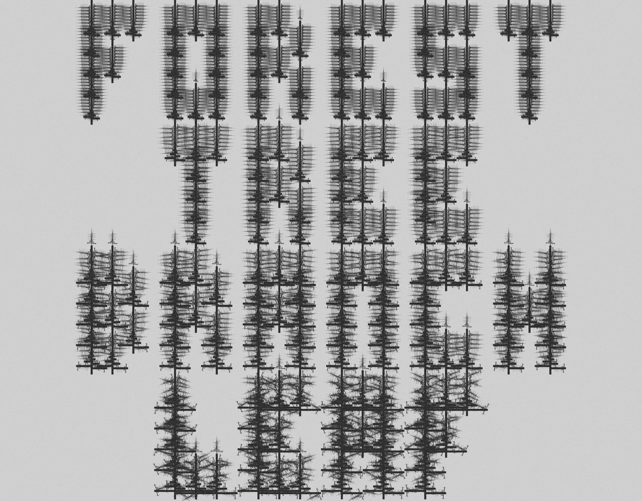
![“Magas/alacsony” (High/Low). Part of project “Oppositions” [RJ 0010]: Experimental booklet design.](https://cdn.myportfolio.com/e510cb4ab3282c2ee88bb5e070952caf/18e21c28-5b6a-4a84-a669-11da09a73902_rw_1920.jpg?h=2ddfca71e05855650dd9a948985aefb6)
“Magas/alacsony” (High/Low). Part of project “Oppositions” [RJ 0010]: Experimental booklet design.
![“Lent/fent” (Down/Up). Part of project “Oppositions” [RJ 0010]: Experimental booklet design.](https://cdn.myportfolio.com/e510cb4ab3282c2ee88bb5e070952caf/0b72bc57-9c36-4c14-978e-9f7c45a2c5f2_rw_1920.jpg?h=4b27282ba628f3354bd53c10b0b67bc9)
“Lent/fent” (Down/Up). Part of project “Oppositions” [RJ 0010]: Experimental booklet design.
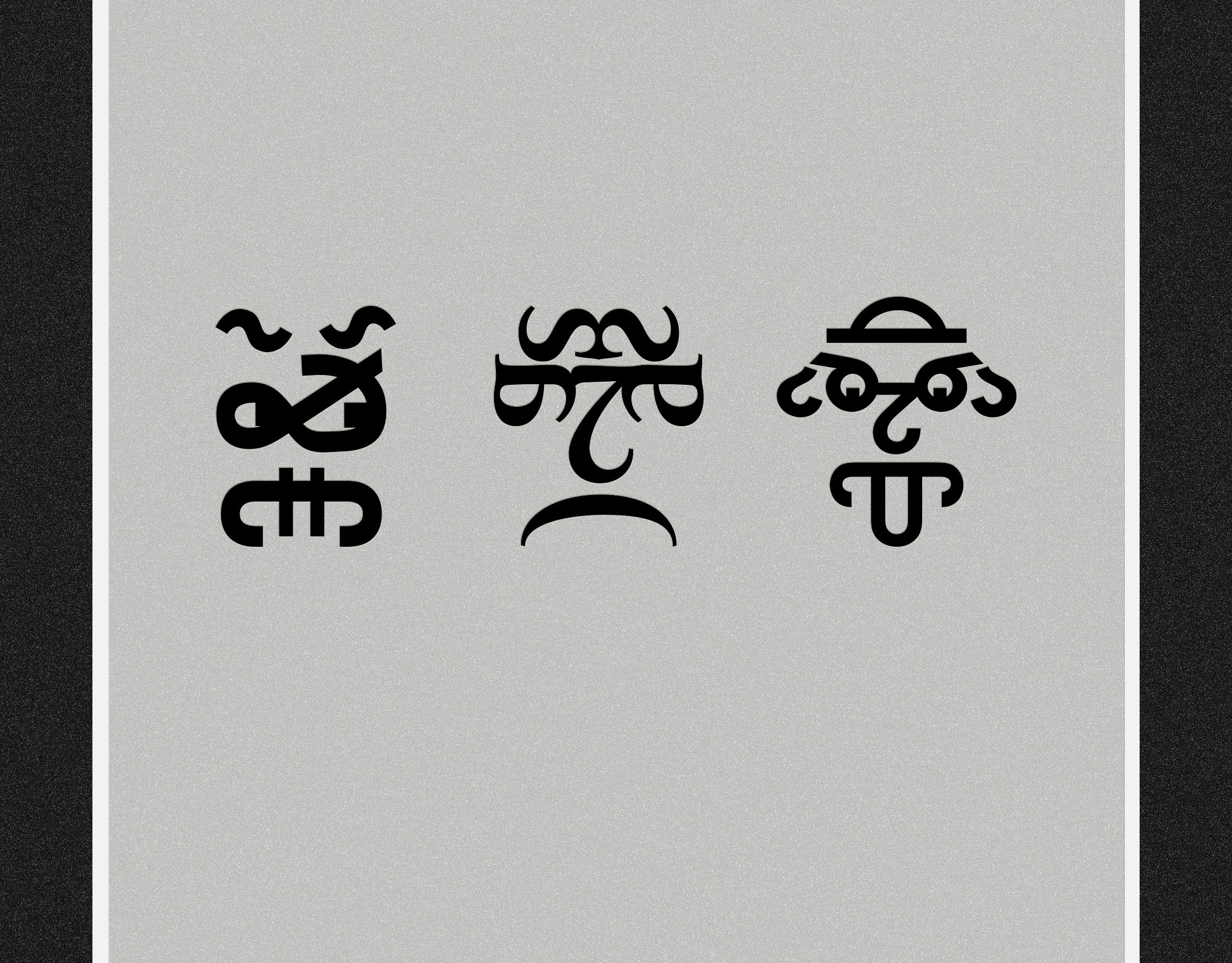
![“Férfi/nő” (Man/Woman). Part of project “Oppositions” [RJ 0010]: Experimental booklet design.](https://cdn.myportfolio.com/e510cb4ab3282c2ee88bb5e070952caf/89eadaf0-aa12-4098-bec7-19220f51452b_rw_1920.jpg?h=b9b3e238bb9b318bc3dfd3fa0774a94b)
“Férfi/nő” (Man/Woman). Part of project “Oppositions” [RJ 0010]: Experimental booklet design.
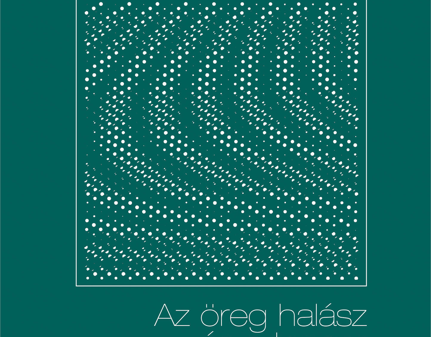
![“Zsúfolt/ritka” (Crowded/Sparse). Part of project “Oppositions” [RJ 0010]: Experimental booklet design.](https://cdn.myportfolio.com/e510cb4ab3282c2ee88bb5e070952caf/0a3a293a-4b6c-481a-a33b-241132118bad_rw_1920.jpg?h=636cd916d82528c0179478d397839525)
“Zsúfolt/ritka” (Crowded/Sparse). Part of project “Oppositions” [RJ 0010]: Experimental booklet design.
External Links
→ Link 1
→ Link 2