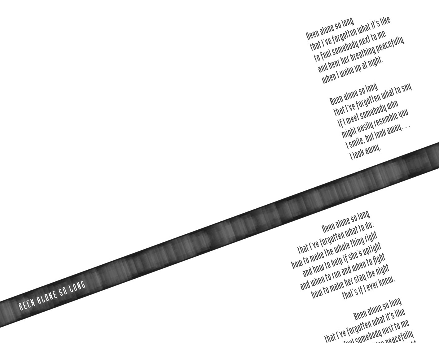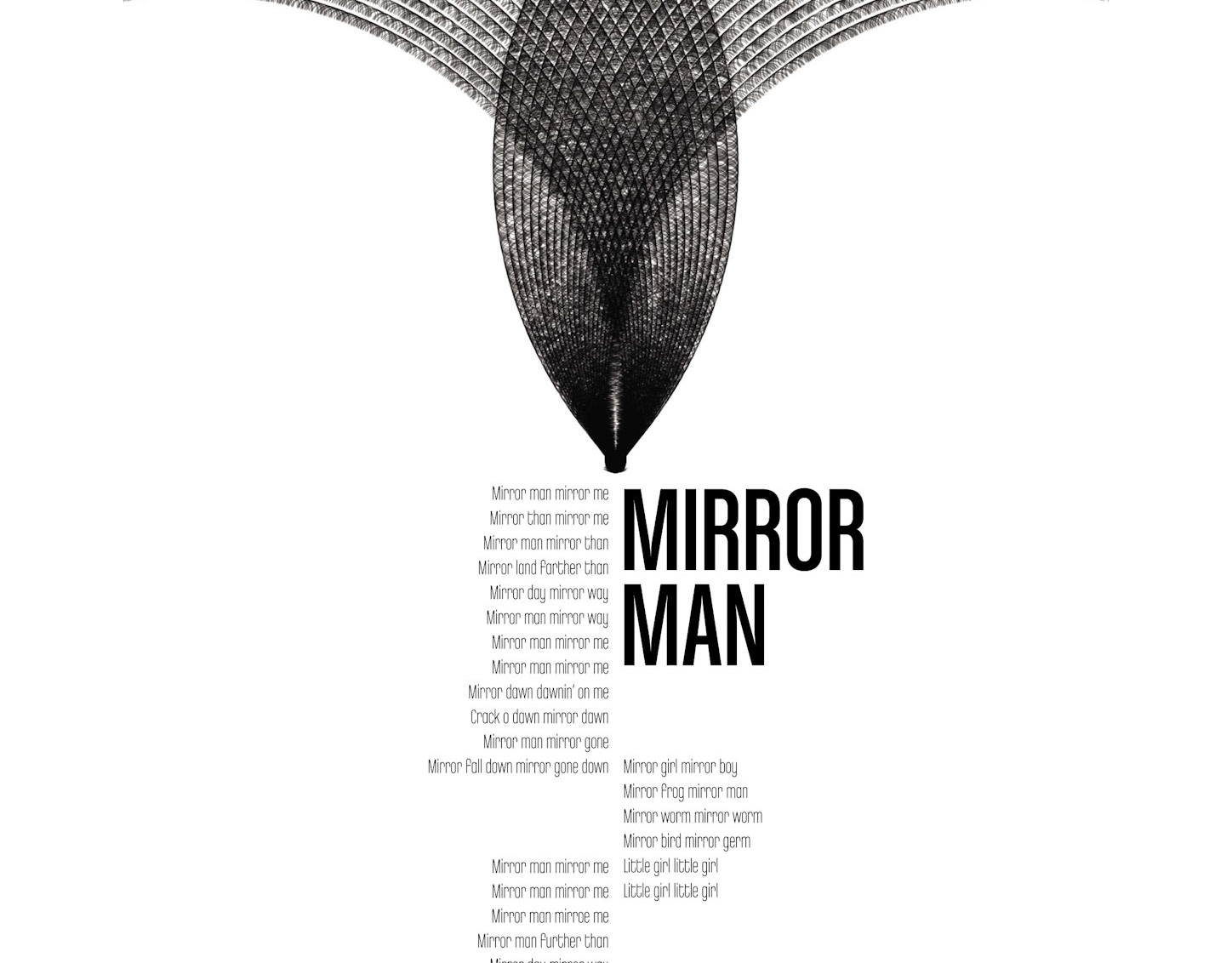
![Illustration. Part of project “Metallica” [RJ 0027]: Poster design for the rock band Metallica.](https://cdn.myportfolio.com/e510cb4ab3282c2ee88bb5e070952caf/386c0b17-fd74-4816-b056-70dc30bfd1df_rw_1200.jpg?h=9ac1e713e4681c1aa613b9a8a0882941)
Illustration. Part of project “Metallica” [RJ 0027]: Poster design for the rock band Metallica.
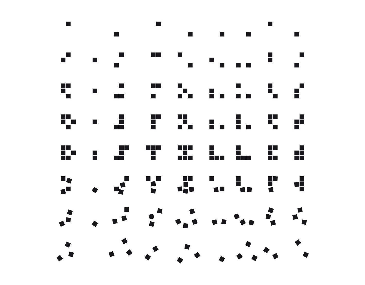
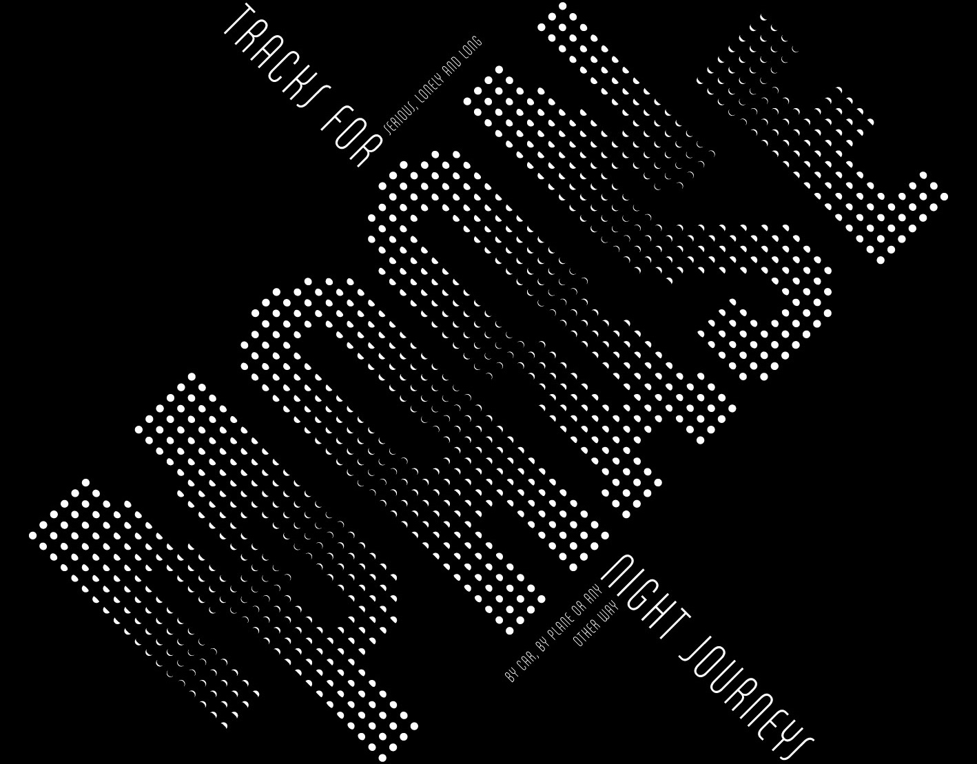
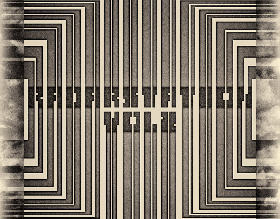
![Typography excerpt. Part of project “Metallica” [RJ 0027]: Poster design for the rock band Metallica.](https://cdn.myportfolio.com/e510cb4ab3282c2ee88bb5e070952caf/6d078a04-be86-4594-9e03-8ce226ca3b57_rw_1200.jpg?h=83f7e4192c278302e1a87755bde8f3cc)
Typography excerpt. Part of project “Metallica” [RJ 0027]: Poster design for the rock band Metallica.
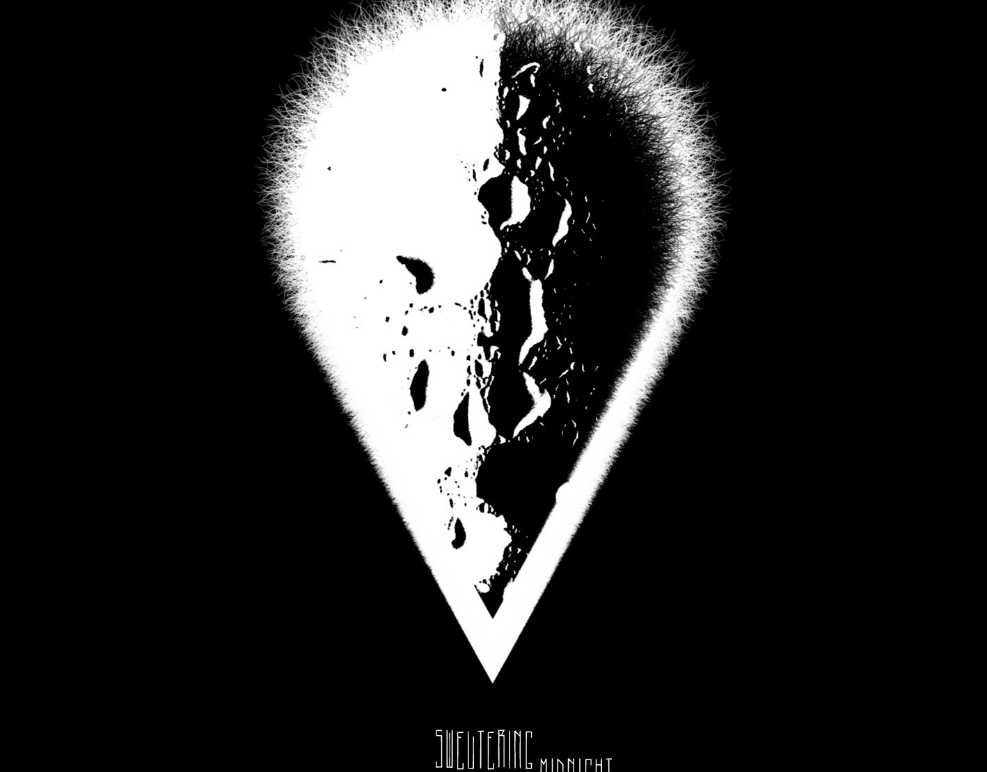
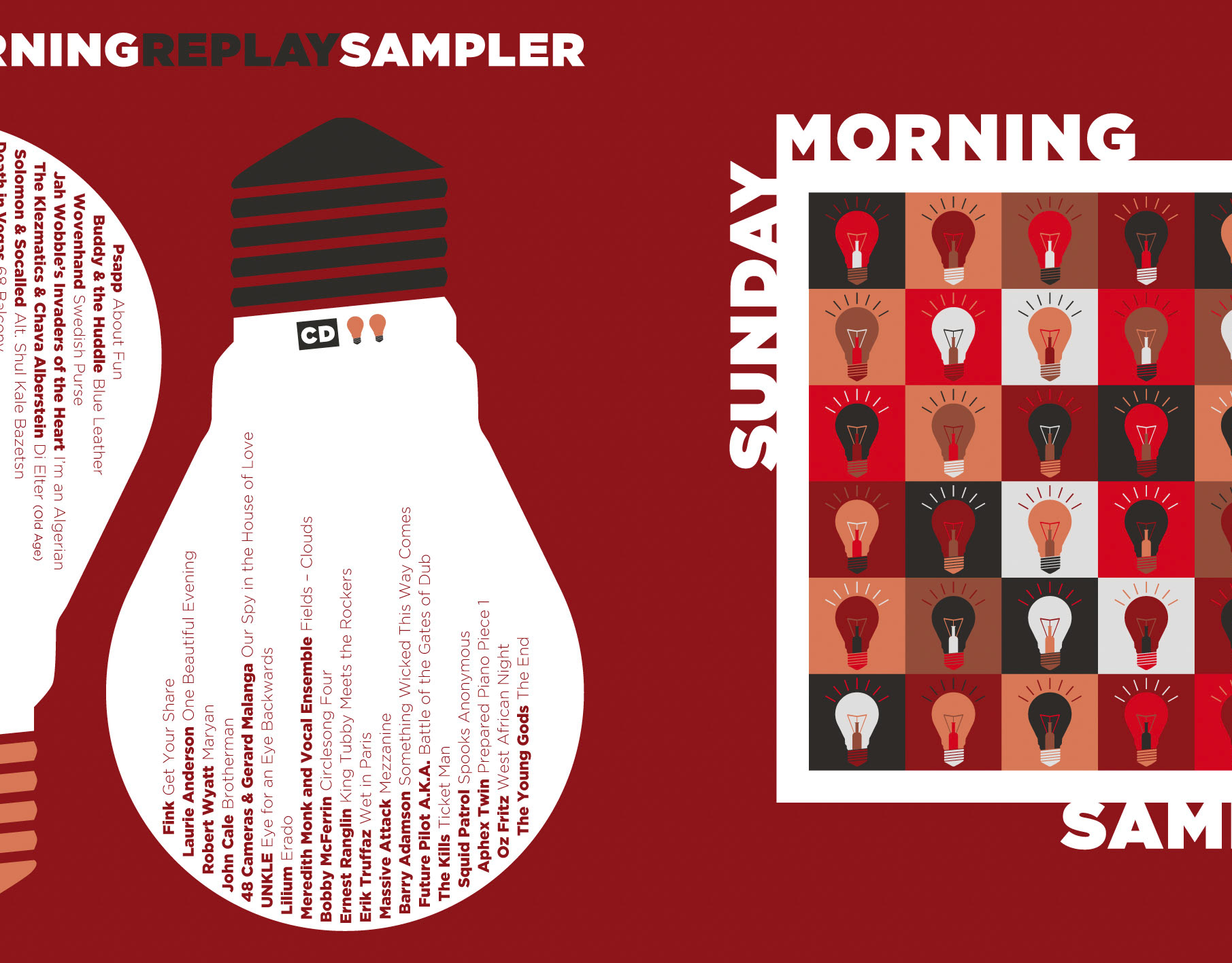
![Full artwork. Part of project “Metallica” [RJ 0027]: Poster design for the rock band Metallica.](https://cdn.myportfolio.com/e510cb4ab3282c2ee88bb5e070952caf/dd6149c8-467f-4ba5-ad57-218a7e791387_rw_1920.jpg?h=9db58d339fb0bbed2e55475441e78ac5)
Full artwork. Part of project “Metallica” [RJ 0027]: Poster design for the rock band Metallica.
External Links
→ Link 1
→ Link 2