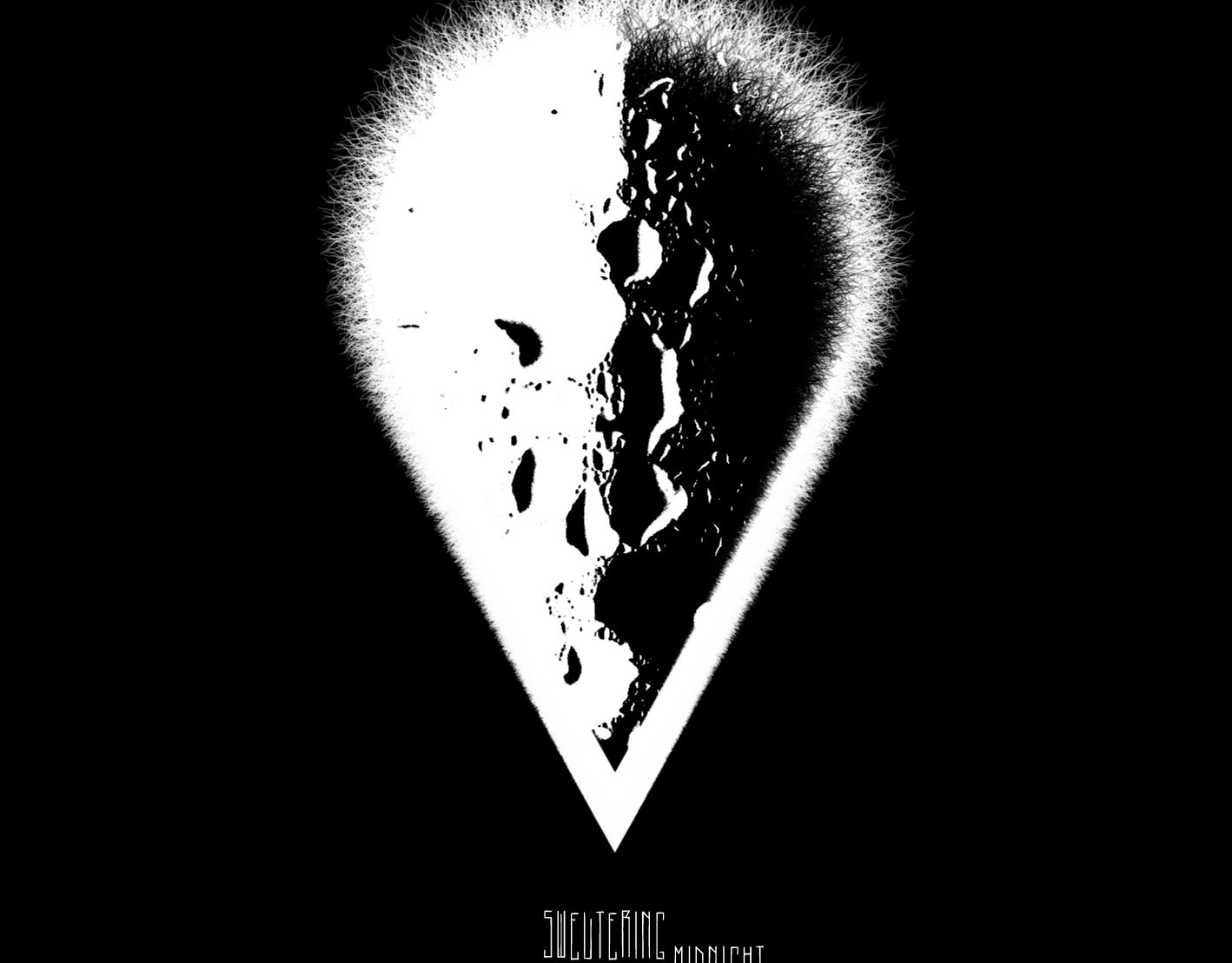
![Front side of the CD booklet. Part of project “Love Is Blind” [RJ 0011]: CD cover art and inlay design for a music compilation about the nature of love.](data:image/gif;base64,R0lGODlhAQABAIAAAAAAAP///yH5BAEAAAAALAAAAAABAAEAAAIBRAA7)
Front side of the CD booklet. Part of project “Love Is Blind” [RJ 0011]: CD cover art and inlay design for a music compilation about the nature of love.
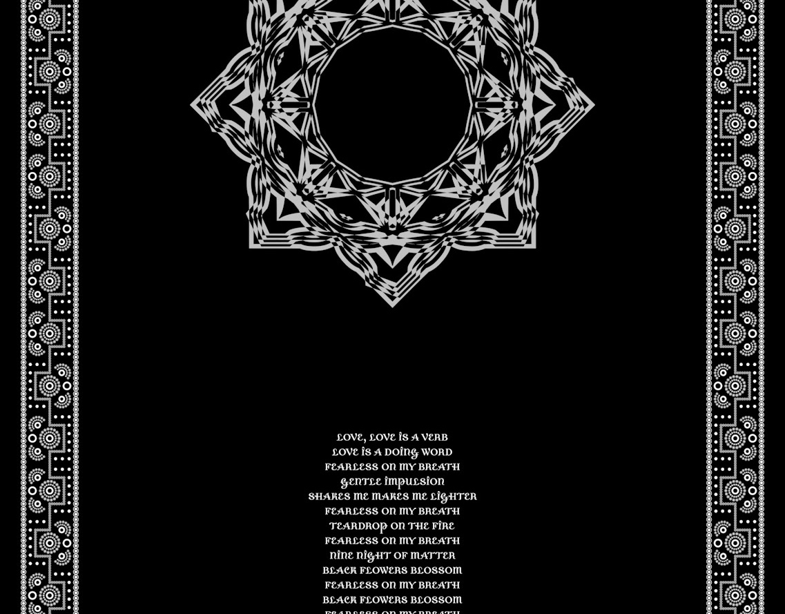
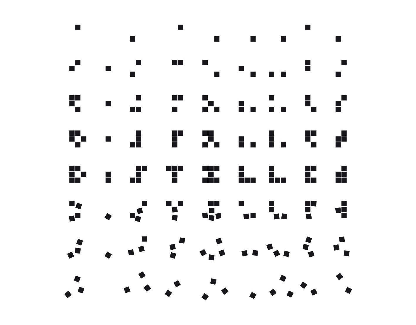
Excerpt from the front side of the CD booklet. Part of project “Love Is Blind” [RJ 0011]: CD cover art and inlay design for a music compilation about the nature of love.
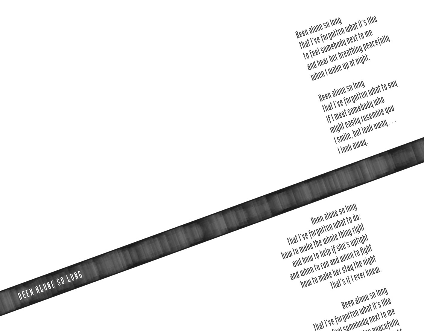
Inlay side of the CD booklet. Part of project “Love Is Blind” [RJ 0011]: CD cover art and inlay design for a music compilation about the nature of love.
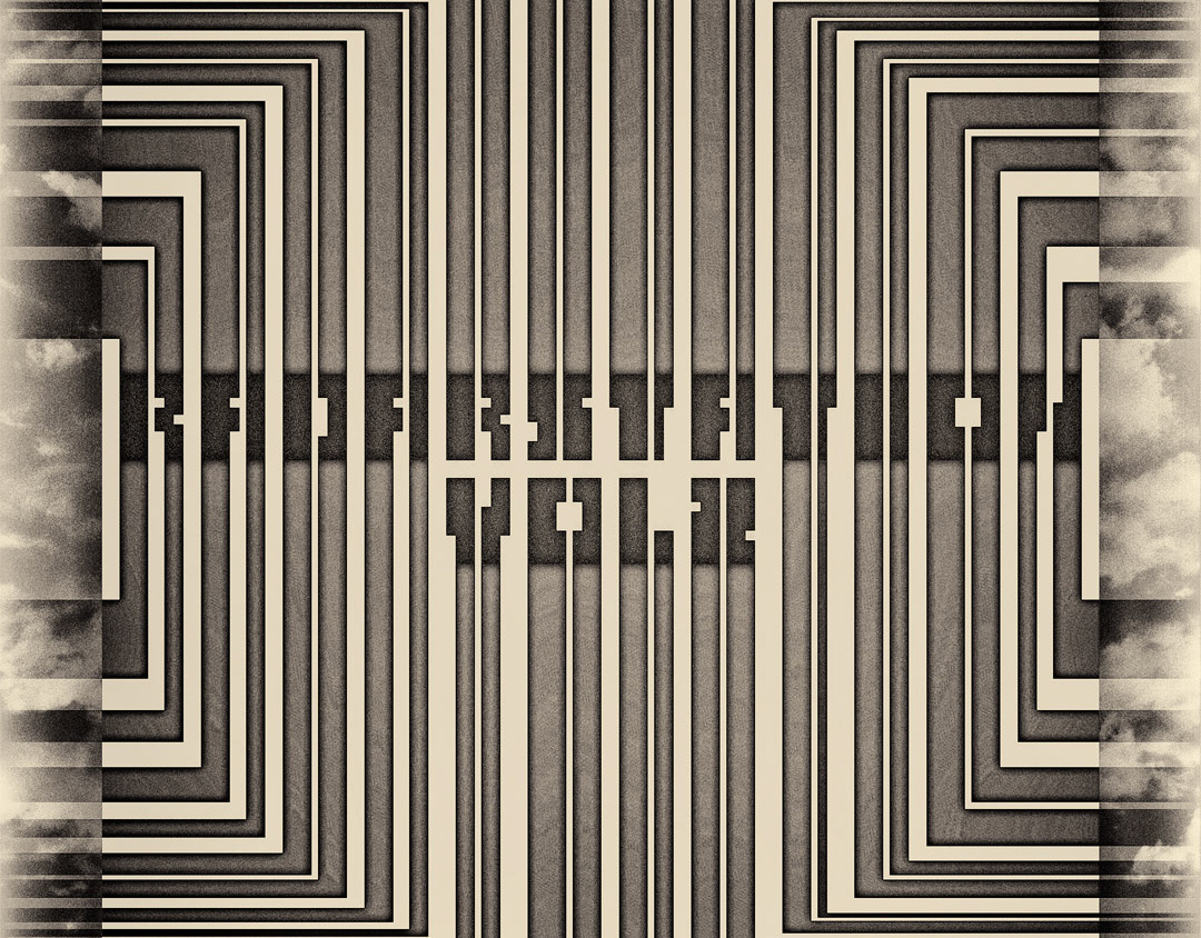
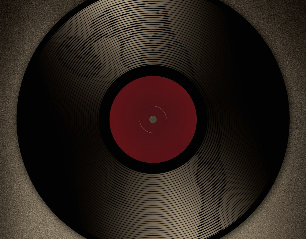
Back side of the CD booklet. Part of project “Love Is Blind” [RJ 0011]: CD cover art and inlay design for a music compilation about the nature of love.
Front and inlay sides of the CD booklet. Part of project “Love Is Blind” [RJ 0011]: CD cover art and inlay design for a music compilation about the nature of love.

![Front side of the CD booklet. Part of project “Love Is Blind” [RJ 0011]: CD cover art and inlay design for a music compilation about the nature of love.](https://cdn.myportfolio.com/e510cb4ab3282c2ee88bb5e070952caf/24bb76ec-2197-42e9-a7db-b664cffa074c_rw_1920.jpg?h=8307f821ce3030d622eee500a0f5d75b)
![Excerpt from the front side of the CD booklet. Part of project “Love Is Blind” [RJ 0011]: CD cover art and inlay design for a music compilation about the nature of love.](https://cdn.myportfolio.com/e510cb4ab3282c2ee88bb5e070952caf/a4d069bf-3399-4a87-bdfd-cf6f32dbb420_rw_1200.jpg?h=a6e9ce2e1e933787545420c13bd608f7)
![Inlay side of the CD booklet. Part of project “Love Is Blind” [RJ 0011]: CD cover art and inlay design for a music compilation about the nature of love.](https://cdn.myportfolio.com/e510cb4ab3282c2ee88bb5e070952caf/731b8ee6-1573-483f-be21-946b36036202_rw_1920.jpg?h=38a6b71f1c427c5ee43388d030c03f82)
![Back side of the CD booklet. Part of project “Love Is Blind” [RJ 0011]: CD cover art and inlay design for a music compilation about the nature of love.](https://cdn.myportfolio.com/e510cb4ab3282c2ee88bb5e070952caf/87ea57ac-884f-4ea8-83a7-1f29f190a6af_rw_1920.jpg?h=06f16c068499f9a48087e94cf5d60b6a)
![Front and inlay sides of the CD booklet. Part of project “Love Is Blind” [RJ 0011]: CD cover art and inlay design for a music compilation about the nature of love.](https://cdn.myportfolio.com/e510cb4ab3282c2ee88bb5e070952caf/d763364c-9184-4702-8e5a-5414688efee9_rw_1920.jpg?h=2ff0359aee40d795a294cefdddae81bf)