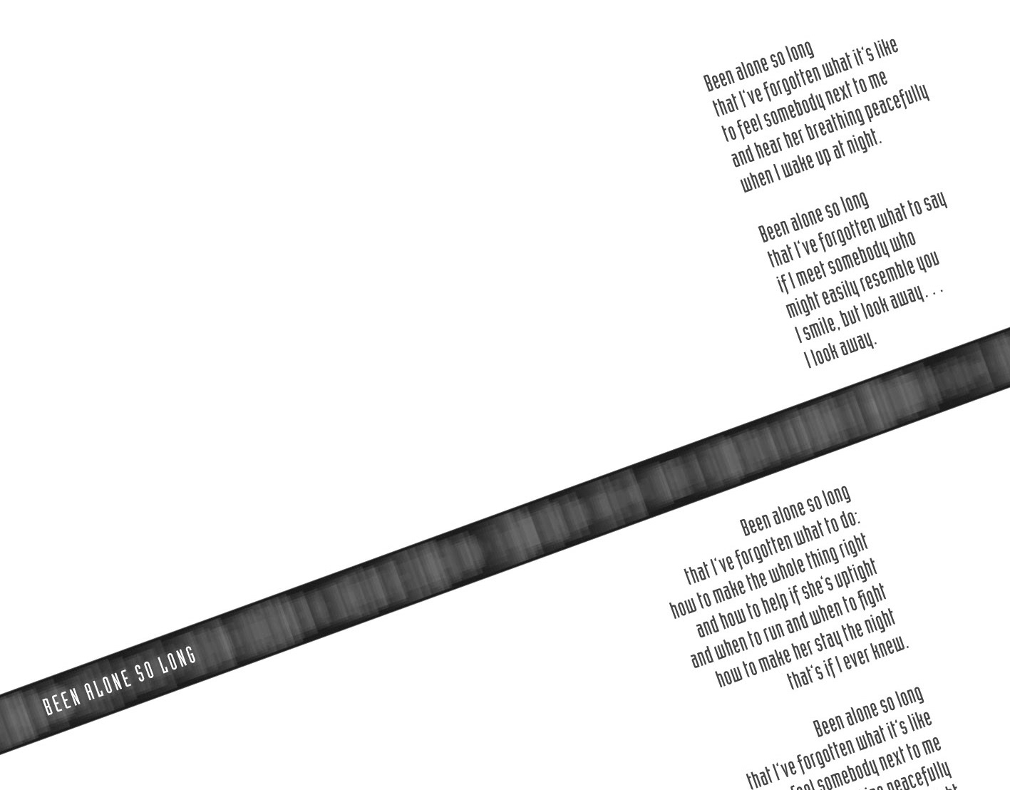
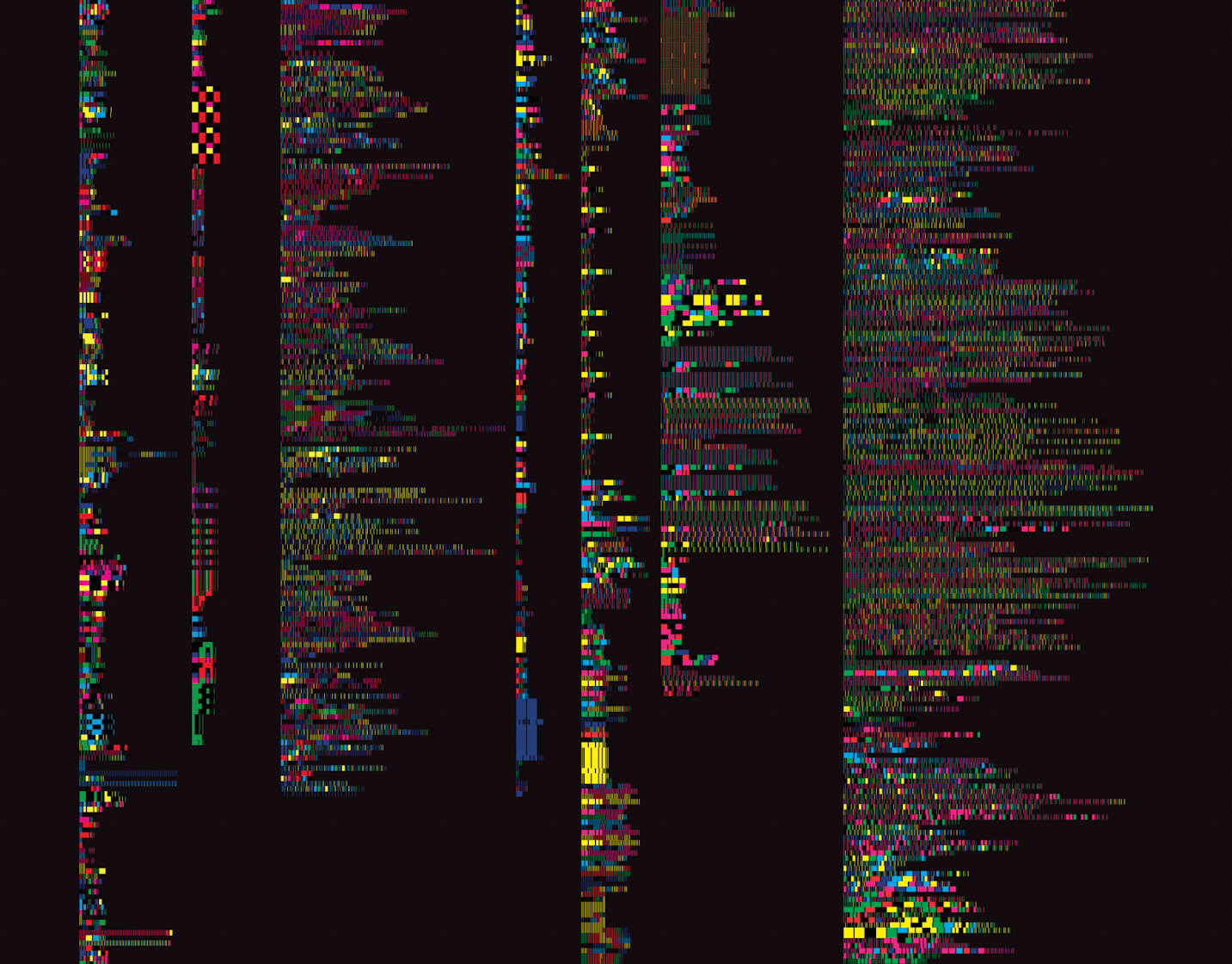
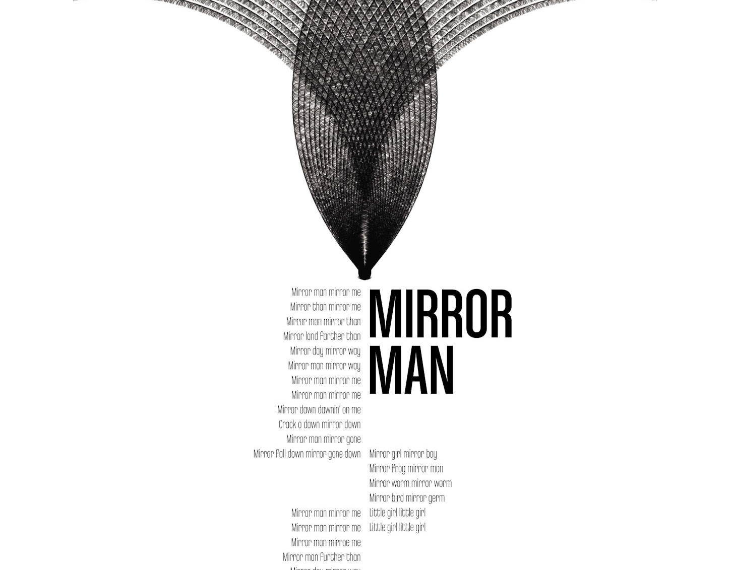
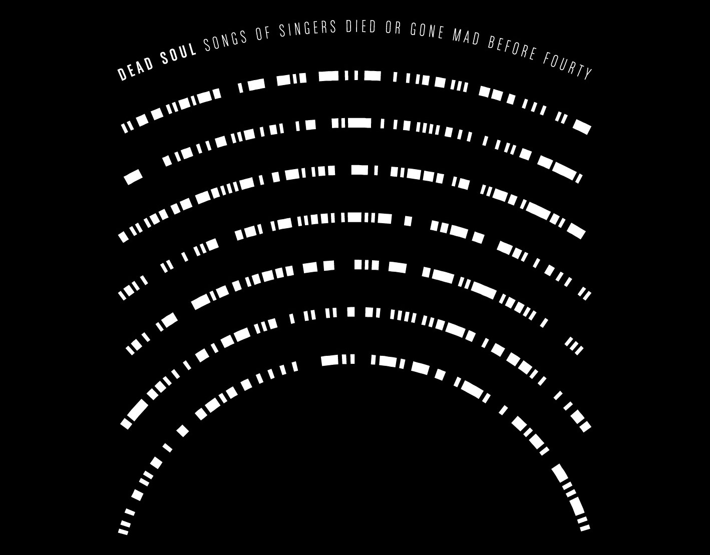
![Front side of the CD booklet. Part of project “Distilled” [RJ 0004]: CD cover art and inlay design for a rather overwhelming music compilation.](data:image/gif;base64,R0lGODlhAQABAIAAAAAAAP///yH5BAEAAAAALAAAAAABAAEAAAIBRAA7)
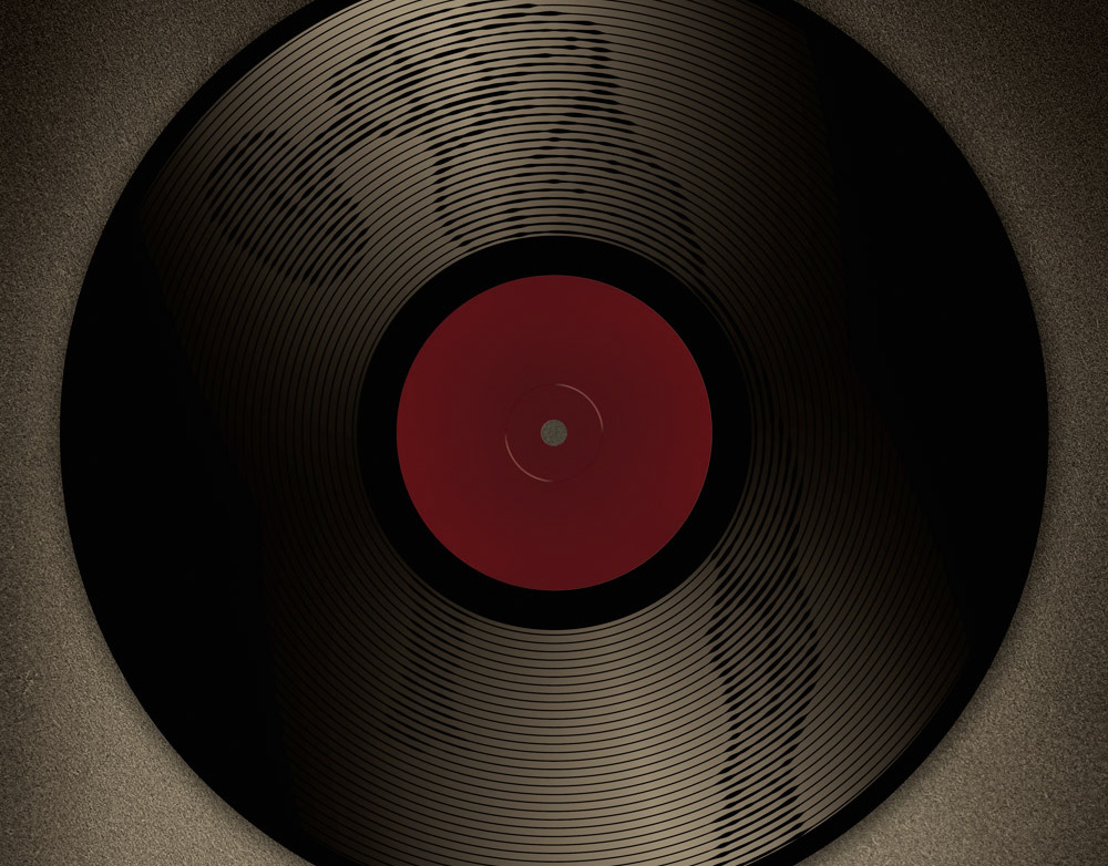
Front side of the CD booklet. Part of project “Distilled” [RJ 0004]: CD cover art and inlay design for a rather overwhelming music compilation.
![Excerpt from the front side of the CD booklet. Part of project “Distilled” [RJ 0004]: CD cover art and inlay design for a rather overwhelming music compilation.](data:image/gif;base64,R0lGODlhAQABAIAAAAAAAP///yH5BAEAAAAALAAAAAABAAEAAAIBRAA7)
Excerpt from the front side of the CD booklet. Part of project “Distilled” [RJ 0004]: CD cover art and inlay design for a rather overwhelming music compilation.
![Inlay side of the CD booklet. Part of project “Distilled” [RJ 0004]: CD cover art and inlay design for a rather overwhelming music compilation.](data:image/gif;base64,R0lGODlhAQABAIAAAAAAAP///yH5BAEAAAAALAAAAAABAAEAAAIBRAA7)
Inlay side of the CD booklet. Part of project “Distilled” [RJ 0004]: CD cover art and inlay design for a rather overwhelming music compilation.
![Excerpt from the inlay side of the CD booklet. Part of project “Distilled” [RJ 0004]: CD cover art and inlay design for a rather overwhelming music compilation.](data:image/gif;base64,R0lGODlhAQABAIAAAAAAAP///yH5BAEAAAAALAAAAAABAAEAAAIBRAA7)
Excerpt from the inlay side of the CD booklet. Part of project “Distilled” [RJ 0004]: CD cover art and inlay design for a rather overwhelming music compilation.
![Back side of the CD booklet. Part of project “Distilled” [RJ 0004]: CD cover art and inlay design for a rather overwhelming music compilation.](data:image/gif;base64,R0lGODlhAQABAIAAAAAAAP///yH5BAEAAAAALAAAAAABAAEAAAIBRAA7)
Back side of the CD booklet. Part of project “Distilled” [RJ 0004]: CD cover art and inlay design for a rather overwhelming music compilation.
![Excerpt from the back side of the CD booklet. Part of project “Distilled” [RJ 0004]: CD cover art and inlay design for a rather overwhelming music compilation.](data:image/gif;base64,R0lGODlhAQABAIAAAAAAAP///yH5BAEAAAAALAAAAAABAAEAAAIBRAA7)
Excerpt from the back side of the CD booklet. Part of project “Distilled” [RJ 0004]: CD cover art and inlay design for a rather overwhelming music compilation.
![Front and inlay sides of the CD booklet. Part of project “Distilled” [RJ 0004]: CD cover art and inlay design for a rather overwhelming music compilation.](data:image/gif;base64,R0lGODlhAQABAIAAAAAAAP///yH5BAEAAAAALAAAAAABAAEAAAIBRAA7)
Front and inlay sides of the CD booklet. Part of project “Distilled” [RJ 0004]: CD cover art and inlay design for a rather overwhelming music compilation.
![Front side of the CD booklet. Part of project “Distilled” [RJ 0004]: CD cover art and inlay design for a rather overwhelming music compilation.](https://cdn.myportfolio.com/e510cb4ab3282c2ee88bb5e070952caf/10cc5026-457c-41a5-ad42-299916fe60e0_rw_1920.jpg?h=305e2b0c8be849f08a77f07d064a54da)
![Excerpt from the front side of the CD booklet. Part of project “Distilled” [RJ 0004]: CD cover art and inlay design for a rather overwhelming music compilation.](https://cdn.myportfolio.com/e510cb4ab3282c2ee88bb5e070952caf/39018876-8bf4-496c-af4a-aaf1fa3c17e9_rw_1200.jpg?h=bd040d1e45aadf343799d49e8ed115c1)
![Inlay side of the CD booklet. Part of project “Distilled” [RJ 0004]: CD cover art and inlay design for a rather overwhelming music compilation.](https://cdn.myportfolio.com/e510cb4ab3282c2ee88bb5e070952caf/befcbeaf-542e-46a1-8103-a221b0fc517d_rw_1920.jpg?h=4a12365ede180f3ffa7ae4ab1205b241)
![Excerpt from the inlay side of the CD booklet. Part of project “Distilled” [RJ 0004]: CD cover art and inlay design for a rather overwhelming music compilation.](https://cdn.myportfolio.com/e510cb4ab3282c2ee88bb5e070952caf/14cf39d8-3b6a-42a6-adf6-277ab365e948_rw_1200.jpg?h=9082ba673cf937af51cb658e6e7580e9)
![Back side of the CD booklet. Part of project “Distilled” [RJ 0004]: CD cover art and inlay design for a rather overwhelming music compilation.](https://cdn.myportfolio.com/e510cb4ab3282c2ee88bb5e070952caf/4b27540c-2e4b-4c6c-aab3-77dd0a5ade24_rw_1920.jpg?h=68259689aff25ef2e003eeaa27fe359d)
![Excerpt from the back side of the CD booklet. Part of project “Distilled” [RJ 0004]: CD cover art and inlay design for a rather overwhelming music compilation.](https://cdn.myportfolio.com/e510cb4ab3282c2ee88bb5e070952caf/7e4344cb-94c1-4638-b3a9-a69160ac9fc7_rw_1200.jpg?h=86bb3d794a354c8d82050f916f7103ee)
![Front and inlay sides of the CD booklet. Part of project “Distilled” [RJ 0004]: CD cover art and inlay design for a rather overwhelming music compilation.](https://cdn.myportfolio.com/e510cb4ab3282c2ee88bb5e070952caf/f96c0df8-ccf7-4263-8623-68318940d3b0_rw_1920.jpg?h=9792b3b582501a77df8cbb97235dcb07)

